

Revivalist is a reader-supported endeavor and our posts may contain affiliate links. When you buy through links on our site, we may earn an affiliate commission.
Wedding color trends for 2027 are moving in a bold direction. Couples are embracing personality, mood and richer contrasts. If you are planning your wedding, this is the perfect time to be adventurous. Your colors can tell your story, reflect your style and create the atmosphere you want guests to remember.
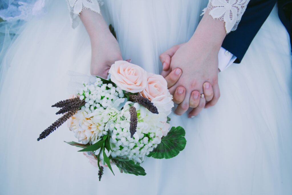
The best wedding color combinations for 2027 balance emotion with individuality. Think earthy romance, dramatic pairings and palettes that feel cinematic without becoming overwhelming. Here are six trendy options to make your wedding unforgettable.
1. Chartreuse and Burgundy: The Bold Trend Taking Over 2027
If you have spent any time on TikTok wedding feeds recently, you have probably seen chartreuse and burgundy everywhere. This unexpected pairing is becoming one of the most talked-about wedding palettes heading into 2027 because it feels simultaneously vintage, editorial and fresh.
Burgundy brings depth and romance while chartreuse adds a surprising brightness that keeps the look from feeling too heavy. The contrast photographs beautifully, especially in outdoor venues, candlelit receptions or dramatic floral installations.
You can soften the palette with ivory linens and muted greenery if you want something elegant rather than edgy. The secret to making this trend work is balance. Instead of flooding every detail with both colors, choose one dominant tone and let the other act as an accent.
2. Sage Green and Butter Yellow for Romantic Optimists
If bold drama is not your style, sage green and butter yellow may be one of the prettiest color combinations for 2027. This palette feels joyful, romantic and quietly confident without becoming overly sweet.
Butter yellow is making a strong comeback in fashion and event design because pale yellow tones like this one evoke a sense of calm and contentment in spaces. Paired with sage green, it creates a nature-inspired look that works beautifully for spring, and they’re also amazing wedding colors for summer.
Think overflowing garden florals, candlelit outdoor dinners and soft textures. This combination also flatters many skin tones, which matters when choosing attire for your wedding party. If you want dimension, layer in cream, pale peach or brushed gold details. The result feels dreamy without losing sophistication.
3. Dusty Blue and Terracotta for Modern Elegance
Dusty blue and terracotta remain one of the strongest choices for couples who want something timeless with personality. The coolness of dusty blue balances the warmth of terracotta, creating a grounded palette that works especially well in outdoor settings, vineyard weddings or mountain venues.
You can make it rustic or refined depending on your styling choices. If you’re going for a more elevated look, use terracotta sparingly through florals, taper candles or table accents while allowing dusty blue to anchor the bridal party styling. This helps the palette feel intentional rather than theme-heavy.
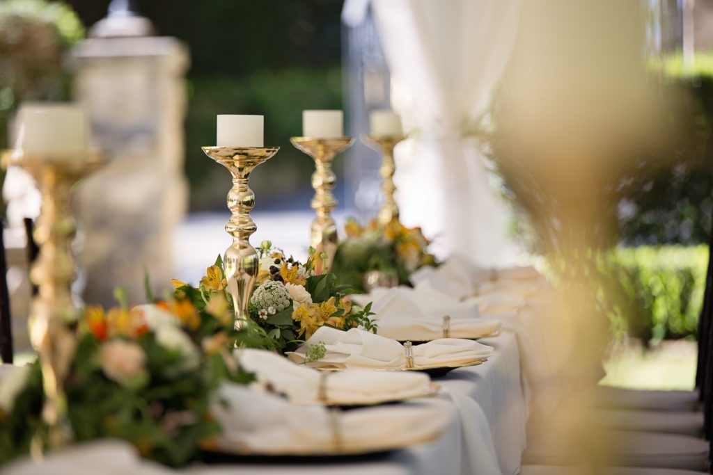
4. Plum, Olive and Champagne for Moody Romance
Rich jewel tones continue to dominate wedding aesthetics. Plum paired with olive green is becoming a standout favorite. Adding champagne or soft gold accents gives the palette a luxurious finish without making it feel overly formal.
This color combination feels cinematic in the best way. Imagine deep plum florals against olive-toned linens, candlelight reflecting off champagne glassware and velvet textures woven throughout the reception design. You can also make this palette seasonal.
If you’re planning an autumn wedding, lean into darker textures and dramatic florals. For spring, soften the mood with lighter blooms and airy fabrics. One of the biggest mistakes couples make with moody palettes is going too dark across every detail. Keep at least one light neutral present so the overall look still feels inviting.
5. Coastal Blue and Sand for Relaxed Luxury
For beach weddings or destination celebrations, coastal blue and sand-inspired neutrals are becoming more sophisticated alternatives to nautical themes. Instead of bright turquoise and seashell decor, 2027 couples are choosing muted ocean tones paired with creamy whites and textured neutrals.
The effect of this color combination feels calm, luxurious and effortless. Studies on color associations consistently find blues linked with feelings of calmness and positivity, which may explain why they continue to resonate in wedding settings.
You can personalize this palette with metallic accents depending on your vibe. Silver can create a cooler, contemporary feel, while gold makes everything warmer and more romantic.
6. Burnt Orange and Mauve for Adventurous Brides
If you love bright colors but still want elegance, burnt orange and mauve deserve your attention. This pairing feels adventurous, warm and is highly photogenic without becoming loud.
Burnt orange adds energy while mauve softens the overall effect, creating a palette that feels balanced and fashion-forward. It works especially well for desert venues, vineyards or outdoor celebrations where natural light enhances the tones.
Try mixing textures to elevate the look. Silk ribbons, dried florals, velvet details or soft draping can make these colors feel luxurious rather than seasonal. The beauty of this combination is flexibility. It can feel playful during the day and deeply romantic once the candles come out at night.
Why Wedding Colors Matter More Than You Think
Wedding colors shape how your celebration feels from the moment guests walk in. However, there’s no need to overanalyze every shade. Instead, think about the emotional atmosphere you want to create.
Do you picture a moody candlelit dinner? A playful garden party? A glamorous black-tie celebration? Your palette becomes the thread connecting florals, fashion, stationery and decor into one memorable experience.
Weddings in 2026 and 2027 are increasingly focused on personality over perfection. Couples are stepping away from “Pinterest copy-and-paste” weddings and leaning into color choices that feel distinctive and deeply personal.
How to Choose the Right Wedding Colors for You
It is easy to get swept up in trends, but the best wedding color combination is ultimately the one that feels like you. Before committing to a palette, think about your venue, season and personal style.
You can start off by finding the perfect venue. Ideally, it should be a place that’s important to you and your partner, so the event feels more personal and meaningful. Then, you can start thinking of color combinations.
Colors that look incredible in a ballroom may feel out of place in a botanical garden. One helpful approach is starting with emotion rather than aesthetics. Ask yourself how you want your wedding to feel — bold, intimate, whimsical, romantic or modern. Build your palette around that atmosphere.
You can also take inspiration from unexpected places like travel memories, favorite artwork or even fashion trends you naturally gravitate toward. If you are struggling to narrow down your options, browsing wedding inspiration can also help you gain clarity.
Choosing 2027 Wedding Colors That Feel Fearless
The best wedding color combinations are all about confidence. Weddings are becoming more personal and expressive than ever, which means your palette can be too. Choose colors that make you excited every time you picture walking into your reception. That feeling matters more than following any trend.


Share this article